In this Photography Questionnaire
I tried asking questions in regard to different photography styles in order to gain more primary research for my upcoming project in order for me to generate more ideas.
In this Photography Questionnaire
I tried asking questions in regard to different photography styles in order to gain more primary research for my upcoming project in order for me to generate more ideas.

These posters are describing the different types of ways in which we can research/ gather information in addition to design skills and how these different design software can make your work look more professional.

The Quick Selection Tool

This tool is used to “paint” certain parts of pictures using an adjustable round brush tip.
As you drag the quick selection tool over your image and it slowly selects the part of the image that you want to edit. Once selected, you can edit this part of the image however you wish by adjusting the exposure, brightness, contrast, vibrance, etc. Additionally, you can also delete the part of the picture that you have selected, for example, the background, then one subject of the picture can be edited out,
However, you can also create the “colour splash” effect this way by simply choosing the “Black and White” option on the Adjustments tab, then the part of the picture that is desired to be in colour.
This is useful because it can make a certain subject of the picture stand out as it is the main part of the picture that is edited, therefore it is an effective editing tool.
Type Tool

The type tool of the picture can allow you to type on whatever is being worked on in Photoshop. This can be on an image or a presentation, for example, a poster. This shows to be helpful as it means that it expands the use of Photoshop. All that needs to be done is to select the type tool and it will pop up on the image. Text can either be typed or copied and pasted. Once the text is there, the font, sized and whether you want the text to bold,italic, underlined, etc. can be changed.

However, the type tool can look effective on a picture because it could be used for certain types of branding or logo making. Personally, I would use this type of tool if I were to make any more posters or logos as it proves to be very useful.
Patch Tool
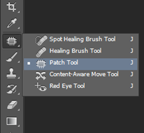
Firstly, when selecting the Spot Healing tool, the Patch tool will come up. Once it is selected, drag a marquee around the area that you want to patch up. The tool clones the selected area while you drag it to the damaged area When releasing the mouse button the tool blends in the source selection and repairs the desired area.
This tool is useful because it is and easy way of repairing parts of a picture and it does not completely obvious. I would personally use it for portrait shots, to get rid of any blemishes to make the image have a more finished look.
Blur Tool

Once the image has been opened, select the blur tool. Then select a brush from the Brush Preset Picker on the larger Brush panel. Select a blending mode from the Mode pop- up menu, then adjust the strength of the blurring effect with the Strength Slider or text box.
Now paint all over the areas that you want to blur.
Once again, I find this tool useful as it can make certain parts of an image stand out. For example, for the Challenge days pictures, it would be a good tool to use for portraits to blur out the background and keep the face focused, which I believe makes the image look more professional.
Dodge Tool
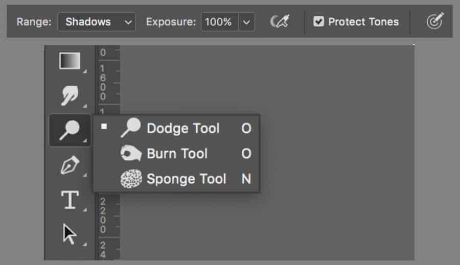
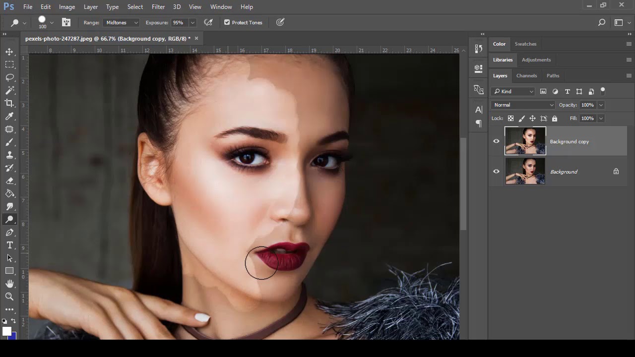
This tool works alongside the burn tool and makes an image lighter or darker depending on the area selected. This can be especially useful for portraits as you are able to choose which parts of an image you want to lighten or darken.
Landscape photography:
Case study-Ansel Adams
Depth of field: all in focus, lower the aperture to wide/open.

Repetition: use creative techniques to represent what you’re taking a picture of- for example, repetition of trees or use of reflection.
Symmetry- aesthetically pleasing- basic optical illusion.

Shapes- reflection of shapes in landscape pictures can be effective.

Leading Lines- draws focus to the main point of the photo.

Candid Street Photography
Process of taking photography of the natural (but usually) urban life of things and person who are unsuspecting.
If the subjects are prepared or the environmental stage, it ceases to be candid. Often easier than other types of photography as it means less planning and idea generation. However, can lead to other potential problems.
The Law:
The Rules:
Concert Photography:
Fast Shutter Speed:

Spot metering:
Set camera’s internal light to spot metering. When shooting concerts, you will often find the artist is lit by a spotlight and the rest of the stage is almost dark. When using spot metering mode, place the artists face in the middle of the viewfinder and you’ll get the right exposure for it. When using the Matrix metering setting, the camera will take a light reading at several points in the scene and you’ll get less overexposed faces.

Single Auto focus Point in the Middle
Use the central focus point in low light situations. This will be the most accurate one. if you don’t have the artist in the middle of the frame, then you have to recompose. Simply push the shutter button halfway down until you lock focus. Now move the viewfinder until you get the desired framing and push the shutter button down fully. To use this technique, you have to set the camera to auto focus single (AF-S for Nikon, One shot for Canon).
Multiple Shot (Burst mode)
Set your camera to multi-shot mode (high speed shooting mode). It allows you to rapidly shoot three or four photos in a row depending on the frame per second of your camera model. It’s more likely that at least one of the four photos is track sharp whereas the others might not be in focus.
No Flash:
Shoot in RAW; If you shoot in JPEG mode, the internal camera computer adds contrast, saturation and sharpness. If you shoot in RAW format, the camera doesn’t process the photo at all. The advantage is that you can change parameters like exposure, white balance, saturation, contrast, clarity and so on afterwards.
Auto white balance:
Can adjust white balance setting in post production.
Product Photography:
Working with many different textures, backgrounds, etc in product photography.
Reliant on a client brief.

Fashion Photography:

Long Exposure Photography

Light Painting in Photography

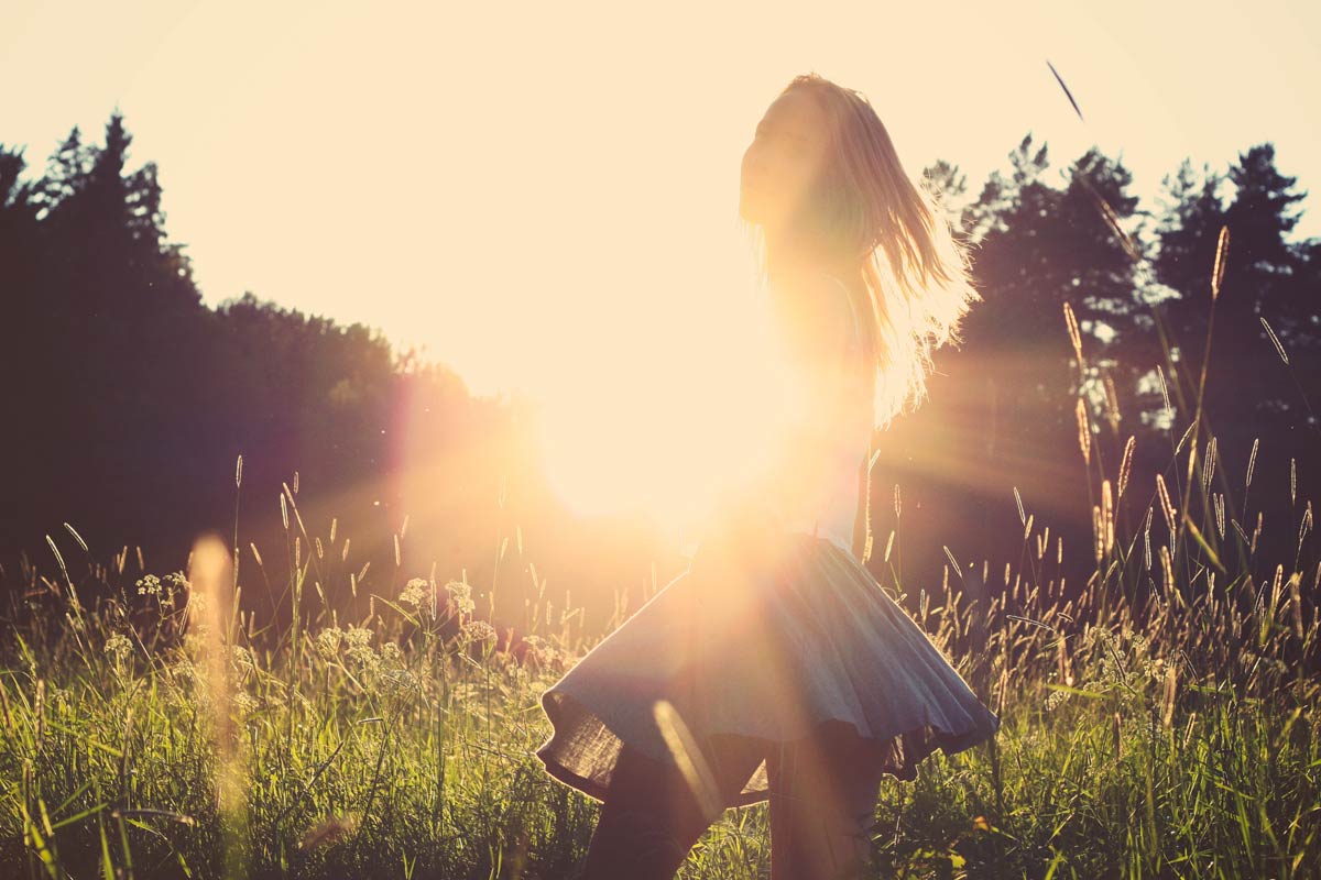
Direct Sunlight Photography
Powder Play Photography

Underwater Photography

Aerial Photography
Camera RAW refers to the type of file format that is higher in quality than most photo types. High end cameras have the option of changing to RAW, this means the photos have better colour ranges. 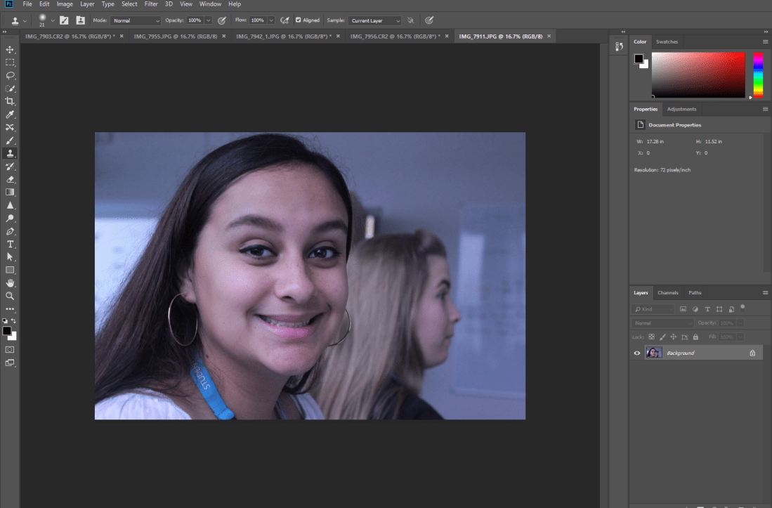
Once selecting the RAW picture that I want to use, Photoshop opens.

To start editing my picture, I select the “Image” tab and select the adjustments. I then start playing around with the different options.
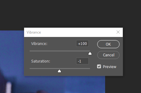
I started off using the the ‘vibrance’ option to boost the colouring of the picture. I also altered the saturation.

Using brightness/contrast settings, I turn the brightness down and up the contrast to ensure that it adjusts correctly.
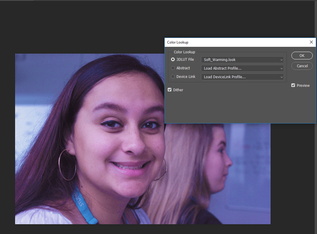
I then select the “Colour Lookup” tab and look through the filters given, in this case I chose to use the ‘Soft Warming’ filter.


Once I do this I add a pink tint to the picture to get the overall filter desired.
Overall, I think this type of effect can change the whole mood of the picture. The original colouring of the picture seeming more grey and sombre, however, with the boosted saturation and brightness and the pink tints adds happiness to the picture. Also, the use of contrast has given more definition to the picture.
‘99 Cent’ 100 Most Influential Pictures Recreation.

We recreated this picture in Sainsbury’s by going to the top of the shop and getting this overview picture. This is how we interpreted Andreas Gursky’s picture, we wanted to capture as much of the shop as possible but we were obviously limited as to what you could do, therefore this was the safest, easiest way to get the picture. When editing this, I tried to add more vintage colouring, as seen in the original picture as it was taken in 1999.

In the Style of David La Chapelle
 This picture was slightly harder to recreate, however, I believe that the setting in which we chose to take this picture can sort of resemble David Lachapelle’s artistic and fun style. The original picture was quite bland, therefore, while editing I tried to make it as colourful and funky looking as possible in order to achieve something similar to Lachapelle. The choice of colouring represents fashion/artistic photography well. I used colours such as blue and purple to create the main tint.
In the Style of Vivian Maier
 In this picture, we tried to resemble Maier’s photography by taking a picture in Fareham High Street of a random passer-by with the architecture in background. When editing, we made the picture black and white to resemble Maier’s vintage style and the time her pictures were taken in.
In the Style of Gregory Crewson

In the recreation of Gregory Crewson’s picture, we took a more cinematic approach by making the picture look darker and sombre. The dark tones bring out Crewson’s cinematic styles, however when editing, we tried to make even darker tones to achieve his cinematic effect. We also took a more artistic approach by the way that the model posed in the picture, instead of posing regularly.
In the Style of Ansel Adams

This picture was easier to get as it was just a simple landscape picture. When editing, I made it black and white and lowered the brightness to match Adam’s style which made the picture more effective.
In the Style of David Bailey

In this picture, we recreated Bailey’s portraiture style of photography. We made the picture black and white to resemble the 60’s style. We got a picture of the model smiling which represents Bailey’s happy atmosphere of his photos.
In the Style of Mario Testino

In this picture, similar to Bailey’s style, we took another portrait style picture. To recreate the fashion based theme, we used a pink tint and used different colours on my face to add more vibrancy and creativity to the atmosphere of the picture, instead of the picture being in the original style it was in, if we did not edit it this way, the picture would not look anything like Testino’s style.
In the Style of Don McCullin

McCullin used to take pictures during the war period however his photography heavily involved poverty/street photography. Therefore when we were in the High Street we took this picture of a homeless person to portray the reality of poverty. While editing, I made the picture was in black and white to resemble McCullin’s style.
White Balance
In this picture, we focused on the cool tones of the area we were in, then when editing we made it even cooler by adding blue tones.
Creative Use of Shutter Speed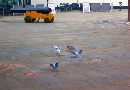
In this picture, a fast shutter speed was used to capture the movement of the pigeon’s flying away. I also adjusted the brightness and saturation to make the picture brighter and more colourful.
Creative Use of Aperture

In this picture, we used a really high aperture in order to gain this type of brightness. However, in Photoshop we edited it even more in order to make it look like the model had no head, which made the picture even more unique.
Creative Freedom
For the last picture, we had a choice of taking pictures in whichever way we wished. Therefore, when I saw this puddle, I thought it would look quite creative if I took a picture of my reflection in it. When editing, i tried to make the picture brighter and bluer in order to get this type of colouring.

The context behind this photograph follows photographer Harry Benson, who originally had no desires to work with the Beatles. He stated that he took himself seriously and was set to cover a news story in Africa. He did not want to cover a ‘rock and roll’ story. However, after meeting the band members and seeing them play live in Paris, he had no intent of leaving. During this time, the Beatles were on the cusp of greatness and Benson was there to capture it. This pillow fight picture was taken in the George V Hotel, the night that the band discovered that their single ‘I Want to Hold Your Hand’ hit number 1 in the U.S.A. Benson freezes this moment in time and joy through the picture of the excited band members celebrating their success.
This picture was taken pretty early on in the band’s career. Their number one hit single was only few of their number ones as the only achieved their first hit in 1963 when their single, ‘From Me to You’ topped the Record Retailer chart and later became the Official UK’s Single Chart. Overall the band has 17 number within their whole career, therefore, when this photo was taken, this was something that was somehow unfamiliar and new to them. In a way, the picture connotes the feeling of innocence more than excitement. As The Beatles became more successful in their careers, they most likely became more accustomed to their success. Therefore, there is something so raw and joyful about this photo as it displays genuine happiness. The fact that this picture is an action shot makes it work very effectively as it is capturing real emotion. This is what applies the realism to the photograph as it almost makes the audience feel like they are there with them.
Another thing about this photo is that it portrays the prominence of the type of music topping the charts during the 60’s compared to the music topping charts in today’s day in age. The genre of music that was popular back then, is very different and drastic to what is popular now. It is not likely that you get bands topping the carts very often nowadays, however, the Beatles did this often during their time. Therefore, the visual signs of this photograph almost implies what music was like back in the 60’s, the closeness of their relationship as a band and how they all genuinely got along. It shows that their music was as real as their friendship. Therefore, the viewers can interpret the entertainment and liveliness of this picture.
This image maintains prominence as it shows the interment details of the bands career. It captured the happiness and success of their career and how they all genuinely enjoyed their careers. It also displays the casual, laid back styles as they are jumping in joy in their pyjamas, instead of modern day music where it seems like musical artists always have to be presented in their best attires.
The Beatles were very/probably the most prominent symbols in music during their career, which means this picture is most likely one of the most influential pictures of them and all time. It represents their success, innocence and happiness.
Macro– Genre, narrative and representation.
Micro– Semiotics, iconography, mise en scene, sound, camera, editing etc.
Macro elements – Genre
Genre refers to the category in which the media text can be put into. This might be multiple genres or no genre.
Questions to ask:
Case study : Donnie Darko
Horror/ Thriller/ Adventure
The visuals from the trailer and the colouring of the scenes. Furthermore it shows that there are mysteries to uncover, and that Drako is the one to solve them.
Young adults/ adults.
There are going to be disturbing/ difficult to watch scenes. From the trailer, it showed very quick, sped up scenes, which adds to the thrill.
Macro elements- Narrative
Narrative refers to the way in which the media text tells a story (or part of a story). This might be explicit or implied.
Questions to ask:
Case study: Gregory Crewson
there is an empty looking street with just one car on the road and a door to car is open. The traffic lights are amber and it seems to be early is the morning.
Macro elements- Representation
Questions to ask:
Case study- Robin Thicke- Blurred Lines.
Micro elements: Semiotics – related to the field of linguistics.
Questions to ask?
Iconography; particular range or system of types of image used by an artist or artists to convey particular meanings. For example,in Christian religious paintings there is iconography of images such as the lamb which represents Christ or the dove which rfepresents the holy spirit.
Mise en scene
Questions to ask:
Lighting/editing/ camera angles
Aperture– hole within a lens, where light travels through into the camera body. The can be increased or decreased depending on the amount of light you want to allow into your image.

ISO– The level of sensitivity of your camera to available light. the lower the ISO number, the less sensitive it is to light, while a higher ISO number increases the sensitivity to light.

Shutter Speed- length of time a camera shutter is open to expose light into the camera sensor. If the shutter speed in fast, it can help to freeze action completely. If the shutter speed is slow it can create an effect called ‘motion blur’.
Photography Task:


Basic Introduction to Photography
Framing and composition
Photography is a basic process which means that rules do not have to be followed. However, there are basic guidelines that most photographers follow. Especially when it comes to framing and composing an image. When analysing an image, look for where things have been placed and more importantly where it has been left out.
Lighting
Lighting of photography is important because light is a fundamental element process of photography. Lighting is usually either high key, where there is a lot of lighting in the photo, or if it is low key where there is not a lot of light. It helps connote certain things about mood, tone and themes of the photo.

Focus
Deciding what is focused om a photo can change the entire perspective of the subjects. By changing the camera lens aperture, a photographer is able to get more or less to focus. This is referred to as having a shallow or deep depth of field.

